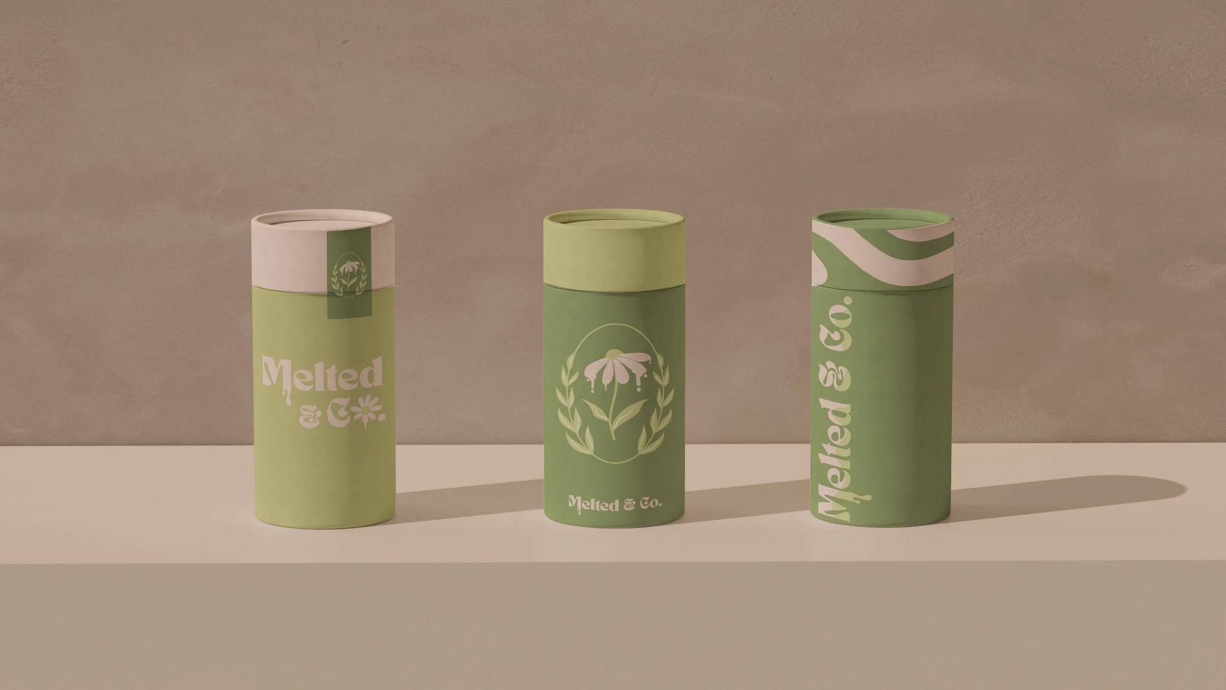
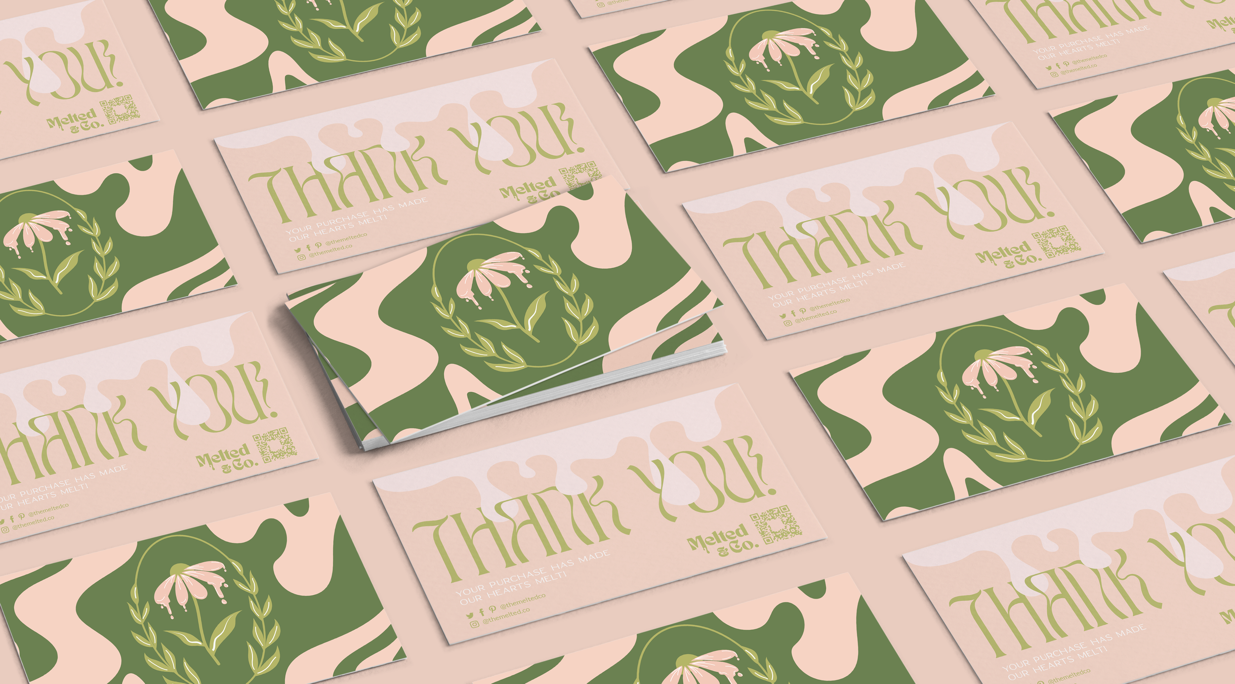
Melted & Co.
A vivid visual identity for a Michigan-based candle house, characterized by a playful interplay of retro-inspired curves and modern, color palettes.
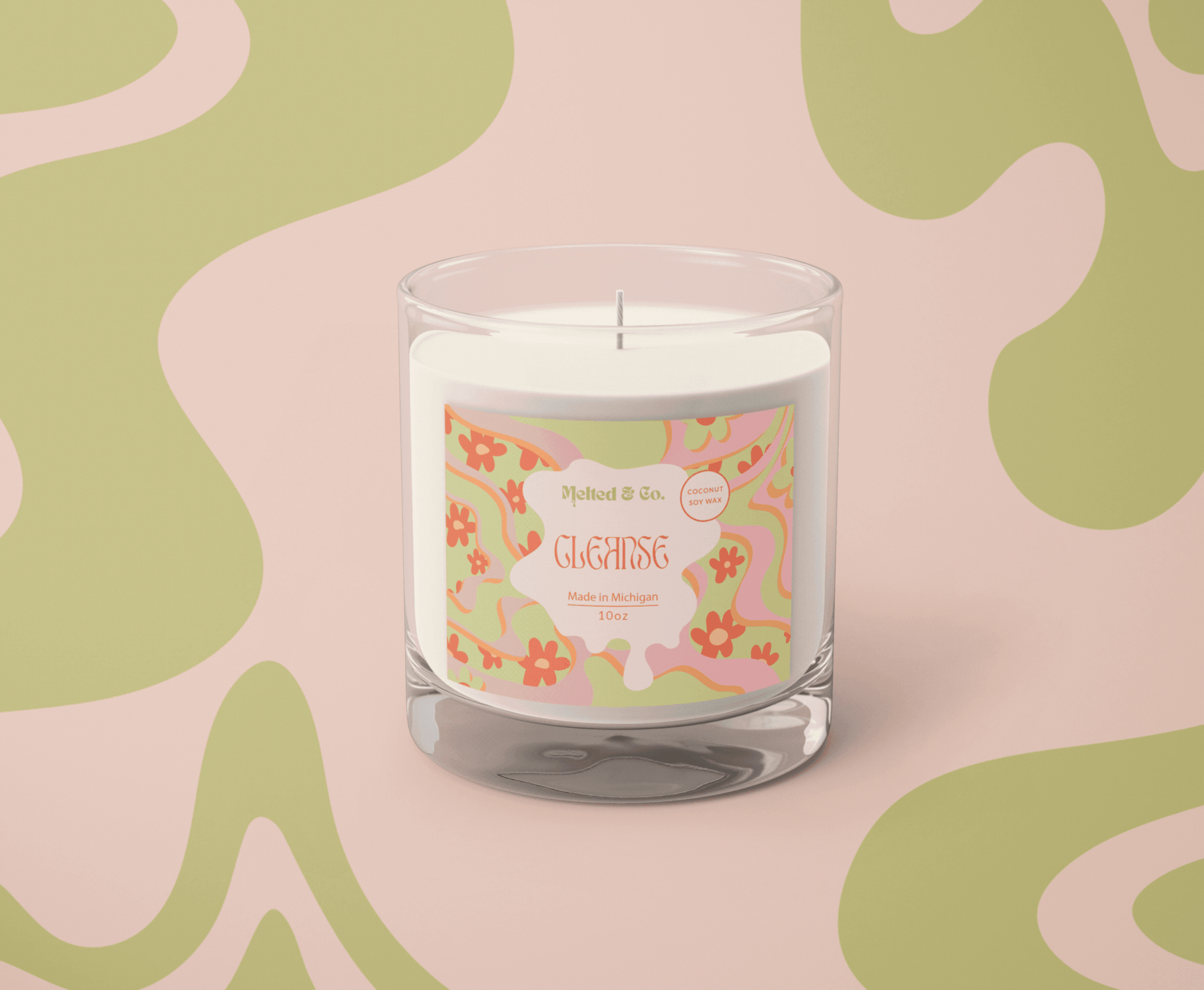
Industry Candles & Home Decor
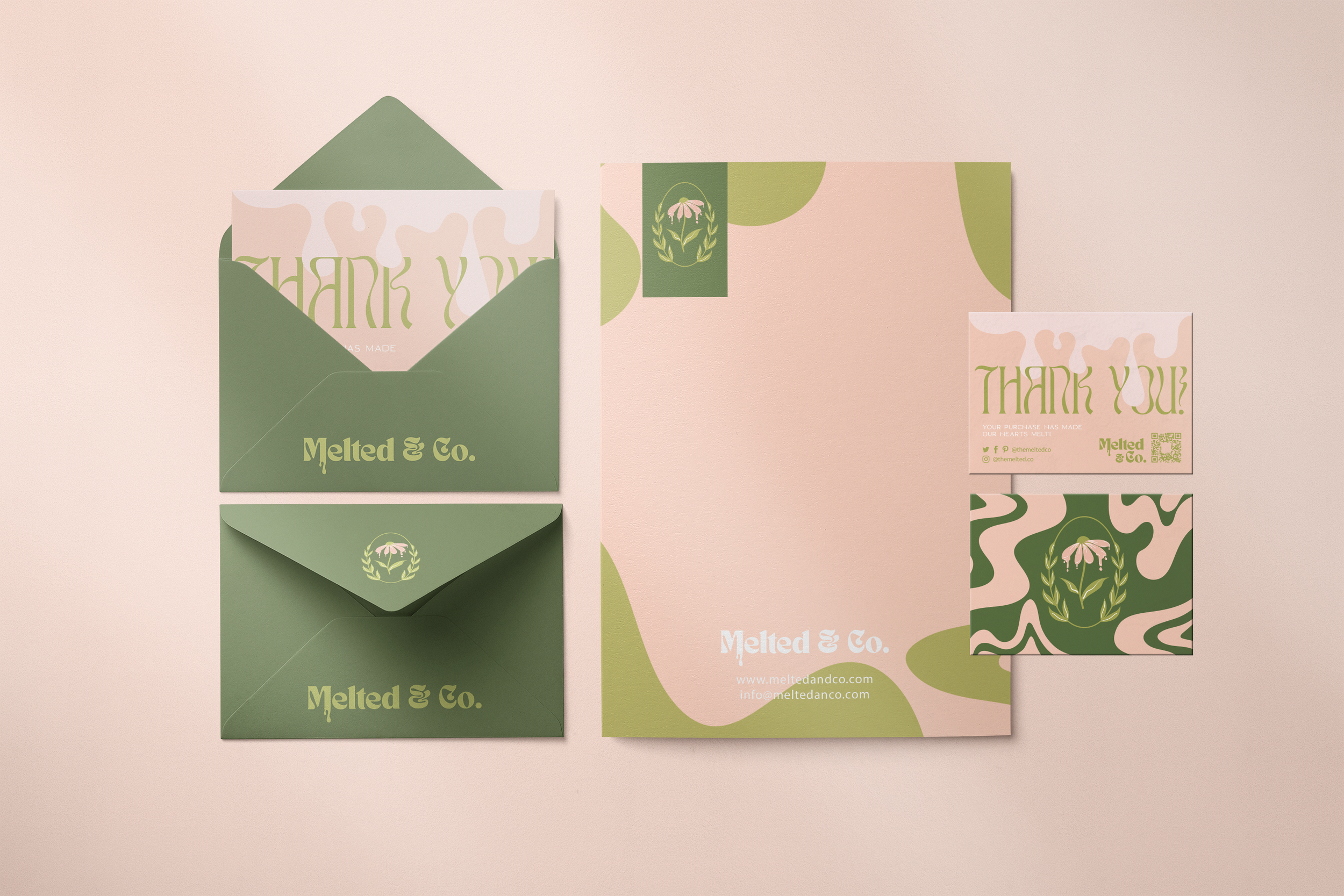
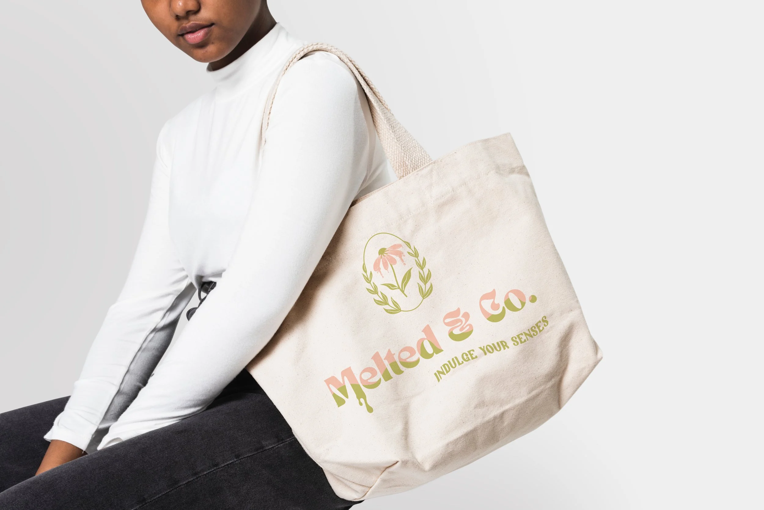
Scope Visual Identity, Packaging Design, Collateral
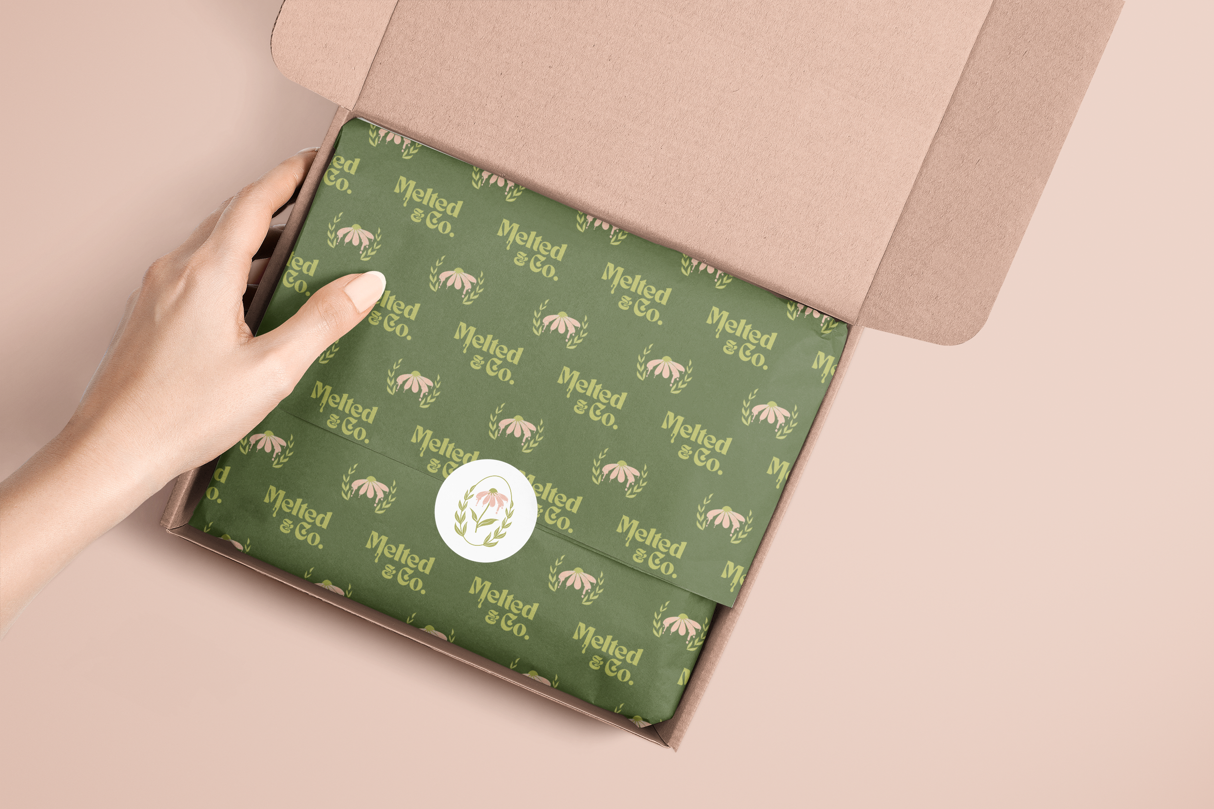
A bespoke typography design, where the fluid, 'melting' nature of wax is integrated into the letterforms of the logo and brand marks. By blending these molten silhouettes with a vibrant, contemporary palette, the branding captures the company’s spirited energy.

This is awesome, thank you so much, I love them!! I’m so happy right now, literally exactly the look I was going for.
— Monique Brown